In the first part of our Plugin Developer Statistics blog post we described the different data sources and chose Metabase as our stats dashboard. Have a look at the article in case you’ve missed it.
Part 2 described how to pull data from wordpress.org and add to an SQLite database. Now we use this data to create a few charts on our dashboard.
Connect Metabase to our SQLite Database
Navigate to the settings icon on the top right and click Admin

- Select Databases
- delete the sample dataset
- and click Add Database
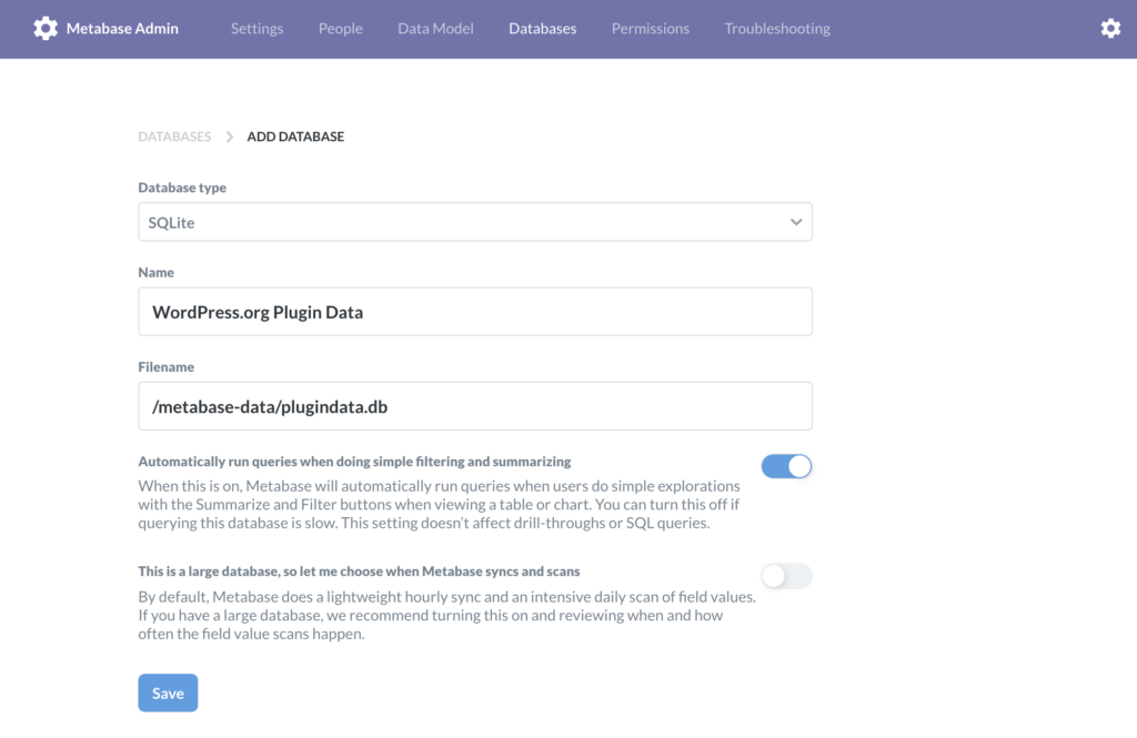
Note: the path to the file is relative to the volume mounted into our docker container in part 1 of this post.
After adding the data source with the values from the screenshot above Metabase suggests some automatic charts. Just discard them and click Ask question on the top right of the page.
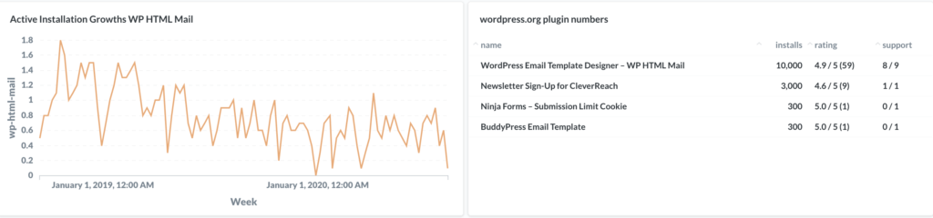
Active installation chart
Select Simple Question and select the Active installation growth data.
Now you should see a table of values. To convert it to a line chart click Visualization on the bottom left and select Line.
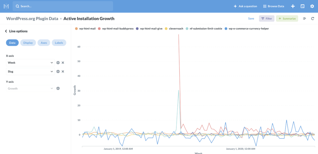
We can already see some kind of chart but I think we should separate the data to show one chart per (relevant) plugin.
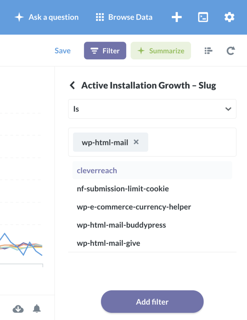
Use the Filter button on the top right to limit the chart to one plugin.
Our first chart is ready to place it on our dashboard. Save the chart and add it to a dashboard when Metabase asks for it.
UPDATE 2020-10-02: Benjamin Intal wrote an excellent article on how to compute your active installation data in detail using the same API we did in previous step. We have added this detailed active installations as a separate article.
Plugin metrics table
Our next dashboard widget will be a simple data table with some relevant numbers which do not need a chart in my opinion.
Start again with Ask a question but choose Native query now. Then enter the following SQL statement:
SELECT name, installs, rating || ' / 5 (' || numratings || ')' as rating, support
FROM wordpressorg INNER JOIN
    (
        SELECT slug, MAX( ID ) AS LATEST_ID
        FROM wordpressorg
        GROUP BY slug
    ) as latest
    ON latest.LATEST_ID = wordpressorg.ID
WHERE wordpressorg.installs >= 300
ORDER BY wordpressorg.installs DESC
We’ve got some plugins with very few installations so we filter our table to plugins with at least 300 installations (see 2nd last line). That’s it, save the question and add it to your dashboard.
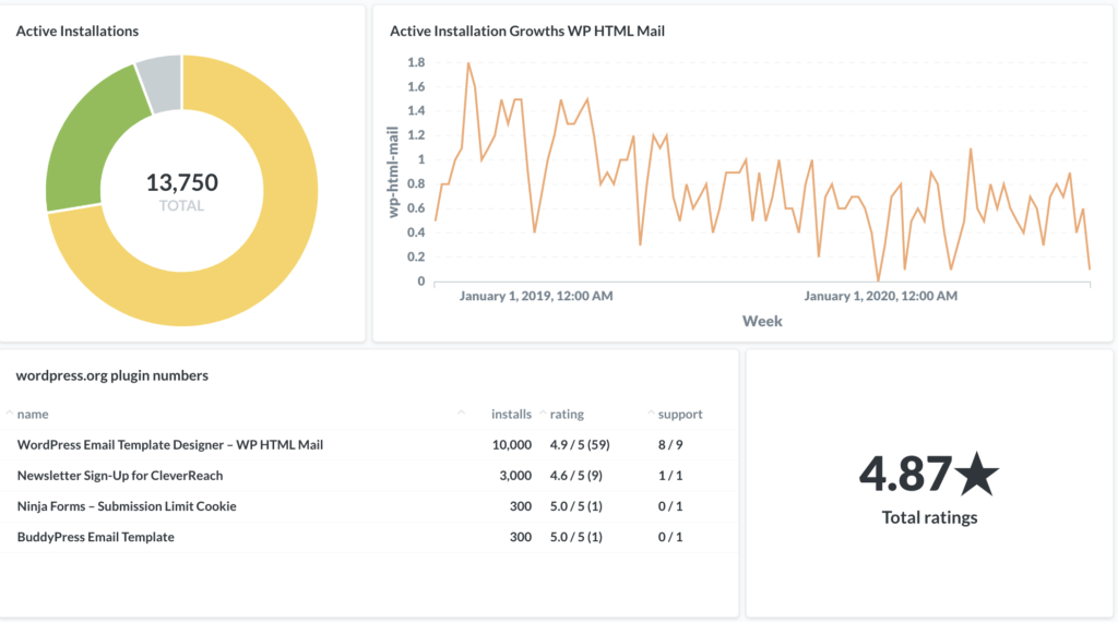
Sum up all your active plugin installation as pie chart
Although this data is not too accurate it is still a great overview.
Start again with Ask a question -> Native query choose WordPress Org data and enter this query:
SELECT name, installs
FROM wordpressorg INNER JOIN
    (
        SELECT slug, MAX( ID ) AS LATEST_ID
        FROM wordpressorg
        GROUP BY slug
    ) as latest
    ON latest.LATEST_ID = wordpressorg.ID
ORDER BY wordpressorg.installs DESC
Then click Visualization -> Pie Chart, save it and place it on your dashboard. If you don’t need a legend for your chart click the settings icon inside the widget to remove it.
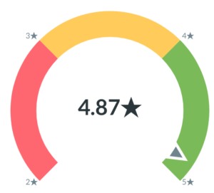
Your total plugin developer rating on your dashboard
The last widget we are going to create from this data source is an overview of our total ratings. We use a native query again with this SQL statement:
SELECT SUM(rating * numratings) / SUM(numratings) as rating, SUM(numratings) as numratings
FROM wordpressorg INNER JOIN
    (
        SELECT slug, MAX( ID ) AS LATEST_ID
        FROM wordpressorg
        GROUP BY slug
    ) as latest
    ON latest.LATEST_ID = wordpressorg.ID
Now you can try different visualizations:

And that’s how our dashboard looks like (for now).